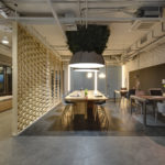
Trending office designs focusing on transparency and collaboration are also important for employee attraction and retention.
BY JAN WILSON
NOTE: This article was originally published in the June 2018 edition of In Business Madison Magazine. The full article can be viewed HERE.
The “big corner office” used to be a coveted place reserved for only the top executive. It may still be for some, but the trends in new office design eschew the dark woodwork and heavy desks of old in favor of light, open spaces.
A recent Sapio Research Wellness Together study of 1,000 United Kingdom-based workers and facilities management experts found a strong link between the workplace environment, worker happiness, and overall business success, with 48% reporting that the office design has an impact on whether to stay with an employer. An equal percentage of respondents said they were either looking for a job currently, or planning to move on within the next 18 months.
As the workforce transitions from baby boomers to the up and comers, research is suggesting that business owners be mindful not only of salary requirements, but also of how their work spaces can help to attract and retain the best employees.
Journalist Lindsey Nolen, in her article, “Office Design Influences Retention” on advanceweb.com, states: “To attract and retain younger talent, companies must make a focused effort to study work styles and analyze the environments that millennials prefer. In doing so, researchers often reflect on where many of these young adults have spent the last four or five years of their lives: college.”
Indeed, as they enter the business world, younger workers may be expecting the same types of perks and environments they were accustomed to in school — open spaces, natural lighting, and freedom of movement.
Design change may be generational, suggests Robin Stroebel, owner and CEO of InteriorLOGIC Inc. in Madison. “Some older employees don’t want change, necessarily, while younger workers kind of expect it. I had one client tell me that when younger candidates enter their office, their faces just drop,” she says.
For a business owner, renovations and office redesign aren’t cheap propositions, and this article isn’t proposing that it’s the only way to attract and retain young employees. But research has shown that so-called “cool” or updated offices lift spirits and make workers of all ages feel and be more productive, as well.
In fact, in America, where the average person spends over 90% of their time indoors (and another 6% in their vehicles) according to the Environmental Protection Agency, workplace design actually becomes a wellness issue.
After all, happy and healthy employees make for happy employers.
So what are the latest trends in interior office space design? And which trends have faded from glory? We asked several area designers for their thoughts and advice.
Diverse spaces
Stroebel (InteriorLOGIC) says a well-designed space should offer diverse areas. “A lot of leading companies are realizing how important the workplace is for their staff. It’s hard sometimes to separate home from work, and design can accommodate that.”
But design for design sake doesn’t work, she cautions. Design has to have a reason. “Companies won’t just upgrade an office space just to do it. They’ll do something because they have a problem, or because they can’t attract employees.”
Often, she says, the staff is the first to complain to management about space, or the lighting, or the functionality of the office. “Design is unique to each company, and it’s up to us to interpret what that means to them and make sure it suits them,” Stroebel says.
Colors these days are more in tune with a company brand, she adds. That doesn’t mean that the Green Bay Packers, for example, need everything to be dark green and gold. “You don’t want color to be inundating. Many companies stay with their branding through fabrics or mixed materials, or shades of a brand color.” A spa, for instance, may use soothing colors to create a mood, but those colors may not necessarily be their logo colors.
“I don’t think companies set out to have the coolest office,” Stroebel admits, “but it’s remarkable how a bright, cheery space can completely alter how a company conducts business.”
It can also improve a company’s public relations beyond the workday, Stroebel suggests, allowing a company opportunities to invite the community into its new space for meetings, or create a splash by showcasing it on its website. “It can be a tool to help attract employees, as well,” Stroebel says, “Show it off!”
Katherine Kawczynski, lead architect at VJS Construction Services in Pewaukee, agrees that an open concept, lower cubicle walls, and collaboration or softer breakout spaces are the latest trends. VJS is a general practice architect, but the company also designs financial institutions.
Facebook, she says, was one of the first large companies to introduce wide, open spaces with open desks, but many businesses have moved away from that model because of noise. “Sure it was open and collaborative, but it wasn’t functional when too many workers were talking at once.”
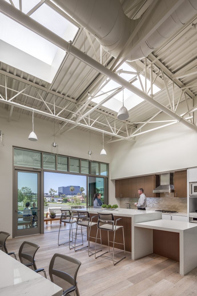
She notes a trend toward executive offices being moved into more centralized areas while smaller, individual workstations are moving toward the perimeter so more people can enjoy the natural light.
Security maturity
Sadly, we live in a world that has necessitated a focus on security. Today’s office designers must consider staff safety as an important element of office design, as well.
“I have to incorporate security into almost everything I do now,” notes Stroebel, “but you also don’t want an entry way to look like a secured entrance.” Overall office design includes everything from where emergency exits are located to whether a company can have a security officer or greeter at the front entrance — dressed in a uniform or not, she explains.
Stroebel has also noticed a renewed interest in window coverings from those who don’t want people to see inside their offices after dark.
Financial institutions, of course, take security considerations to higher extremes, notes Kawczynski, and designers work closely with security companies, particularly in regard to front door entrances. Glazing or acrylic panels help strengthen front windows, but they can be pricey.
Banks no longer need to hold millions of dollars in cash in their vaults, she adds. “Vaults in view are long gone and the amount kept inside a vault is kept to a minimum, so it’s much more secure.”
The sturdy teller walls of old are going by the wayside, too, Kawczynski notes, and are being replaced by individual pods or desks that are more conversational and not as imposing. That, in her opinion, is a good trend.
“The teller wall might have prevented someone from gaining access to the teller’s space and cash drawer, but if you think about it, it could also prevent employees from escaping in a crisis if there wasn’t another exit nearby. It’s sad, but as designers we always have to consider the number of exits and escape plans, as well.”
Keane on design
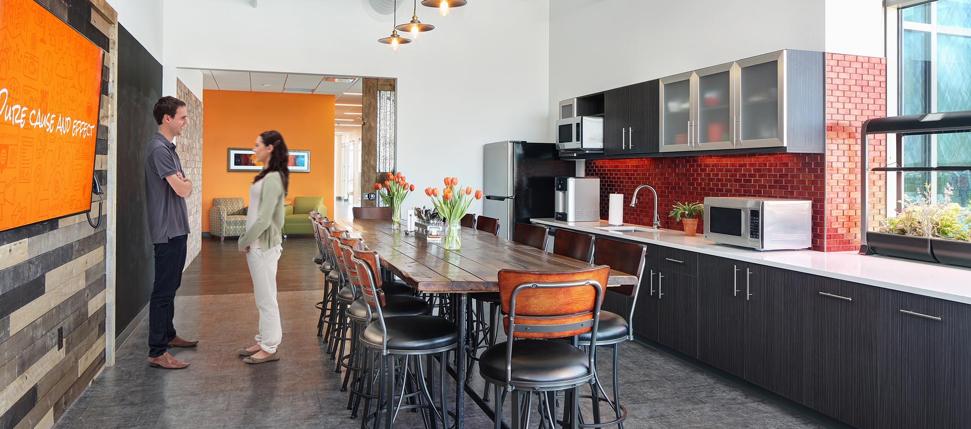
When owners Lucy Keane and Scott Rippe made the decision to move their marketing company, Rippe Keane, into a new space on Junction Road, they involved employees early in the discussions. “They knew exactly what it did and did not want,” recalls Stroebel of InteriorLOGIC.
They did not want carpeting, for example, but wanted a few private offices.
“They wanted natural light, openness, interesting lighting fixtures, and to live their brand in their space,” Stroebel reports. It was also important to staff that they have a couple of dining options, from gathering around a large farm table to sitting in more intimate diner-style booths.
Stroebel suggested they use luxury vinyl flooring because it’s available in a variety of styles and colors and has some sound-dampening benefits. “Nobody wants a loud space,” she says.
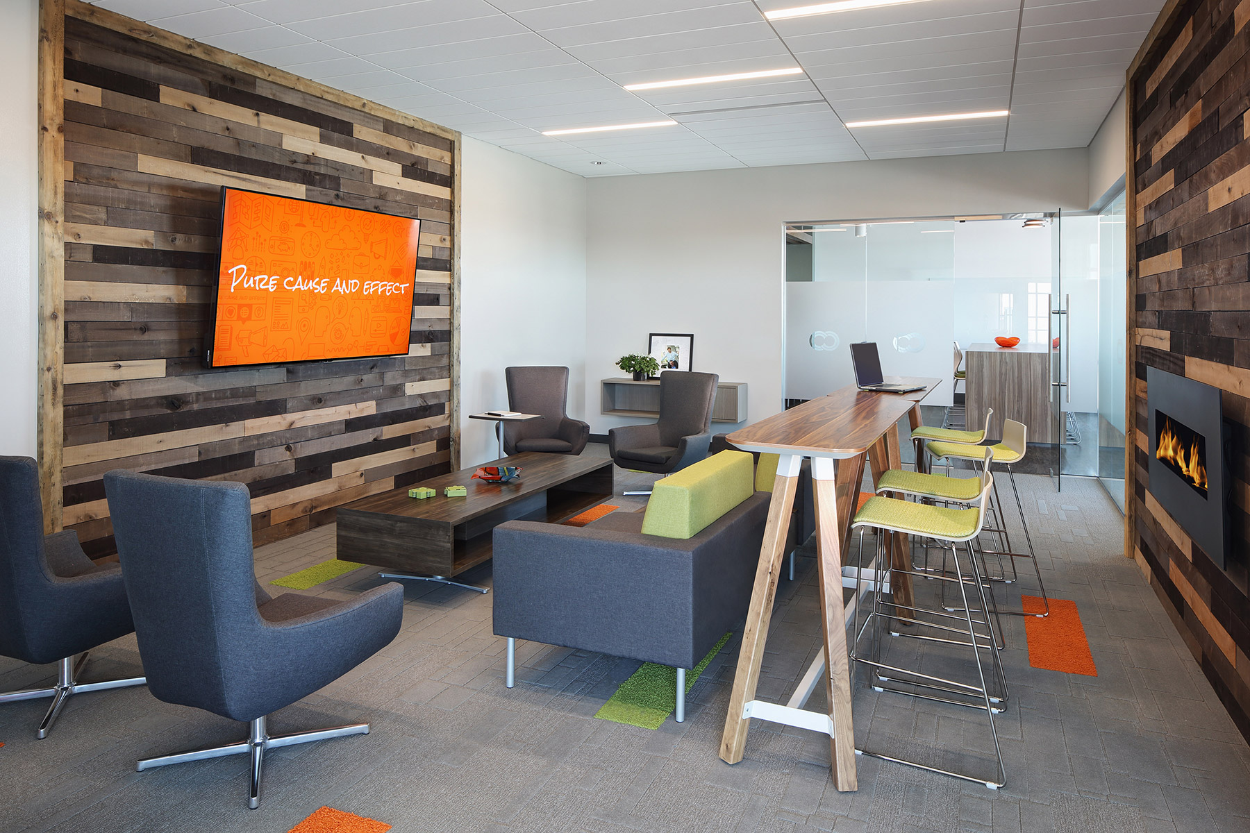
Throughout the new space, employees are able to jot down their creative thoughts or ideas on any of a number of dry-erase or chalkboards, and clients can even relax in a waiting area with a fireplace.
Trends for Madison Commercial Designer
What’s hot:
- Biophilia, or connecting with nature through natural materials, views, daylighting, or soft shapes
- Diverse lighting (LEDs, accent lighting)
- Sit-to-stand work surfaces
- Smaller collaboration areas with soft seating
- Healthy food options, recycling, outdoor spaces, and bike parking
- Luxury vinyl flooring
- Touchdown spaces where employees can quickly plug in their laptops, charge their phones, and instantly connect to email and voicemail
- Building and main entrance security
- Assigning larger offices to those spending more time at work rather than by title.
What’s not:
- Tall wall panels between offices
- Large private offices
- Mauve and green!
What’s timeless:
- Ergonomic furniture and features
- Clean lines, Scandinavian-style furniture
- Textiles/leather
- Natural light
- Openness, collaborative spaces
Sources: InteriorLOGIC, CCIM


